


This week I’ve worked on developing a framework to teach my team the art of crafting and storytelling insights. This is, as opposed to sharing only information.
It is in every way, absolutely an art and one thing I have learned is that it’s very rarely obvious and VERY rarely something that can be achieved from the few data points we start with.
It almost always requires further digging.
It almost always requires further context.
It almost always requires further iteration.
Suffice to say, sharing INFORMATION is fast and easy.
Finding the INSIGHT is truly an art, and great art takes time.

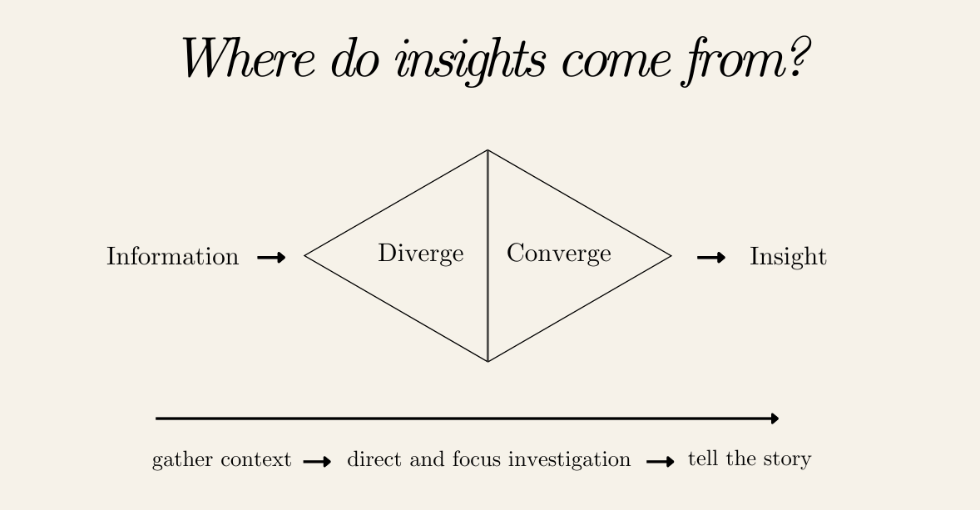
So what’s the pathway to go from information to insight?
It starts with gathering context.
In the first ever Attribution Gal newsletter, I included a little framework I developed for crafting insights. I’ve included a screenshot below.
Despite sharing the process to get there, I realised when pulling together some training material for my team that I never truly documented all of the steps required to get from the left to the right of this diagram.
So that’s what this newsletter is all about.
At the highest level, gathering insights requires identifying the information and then diverging out to look at all of the numbers you have, seek to identify patterns and ask yourself further questions.
Once you have a set of interesting patterns and questions, you can “converge” back into your data set to isolate the few key, additional data points that can help you draw a clean line through the narrative the numbers are telling you.
Then, you’ll have insight.
Sound easy? Well let’s not stop there. There are a few practical tips I’ve identified I’ll refer to often to help with each step. Let’s get into it.
Step 1) Gather context
Without context, it’s no wonder an analyst can only but recite back information. What else could they say about it really? So how can we go about gathering context.
Step into the scenario:
In the Marketing and Technology Consultancy I work for, we run a lot of performance reports. These look like onsite experimentation programs, CRM & loyalty programs, omni-channel personalisation and more. One of the great things about marketing (in some ways) is we are all consumers ourselves and therefore, possess the ability to use our imagination to step into the shoes of our customer to understand what actions they might be taking that lead to the numbers we are seeing.
Take an onsite experiment for example. In these reports, we typically compare the performance of the “control” experience (what happens today on the clients website) with a variation, where there was a decision to tweak something.
Sometimes as analysts, we aren’t always exposed to all of the research or strategic thinking behind why the variation was developed the way it was, but we can still put ourselves in the shoes of the customer to imagine how an experience might differ between one experience or the other.
Take these two hypothetical examples and give it a try.
What do YOU think the customers in the first experience would be more or less likely to engage in given the set up? How does this compare with the second experience?
Hypothetical “information” vs “insight” will follow later in this newsletter… but have a think about how you as a consumer might navigate these differences.


Note, this test does not exist. I used Canva to move around their features to illustrate an example.
Collaborate:
If engaging in this exercise feels less intuitive to arrive at a conclusion, seek out those who can add additional context for you.
Perhaps there has been a governance requirement enforced and the team are looking to quantify an assumed negative impact to volume and engagement.
Perhaps there was a product recall during the experiment window that may have influenced particular product pages and categories.
These are macro factors that you simply cannot fully understand without collaborating. It’s also an apt reminder that the “Diverge” stage can take many iterations of drafts to finalise a compelling, insightful narrative.
The outcome of this first phase is to land with one or two “Insight Hypotheses” from which you can conduct some further investigation to prove or disprove.
An insight hypothesis based on the example above might look like:
If the number of add to bags and transactions are lower on the variation, this may indicate that the positioning of the product description at the top of the page, with improved visibility is key to driving engagement and conversions. Despite hero-ing the “engagement” features such as choice of colour and size, moving the the position description to lower on the page may have made it less visible and in turn, didn’t meet the needs of the customer.
With an assumption or hypothesis in hand, you’re ready to move onto Step 2.

Step 2) Direct and focus investigation
Now that we have the context we need, we can brainstorm what additional metrics will strengthen, or even further disprove our insight hypothesis. In the above example, it’s “clicks on the product description” and “page exit rate” that were not in the first round of analysis. This is where further investigation will be focused.
It’s inevitable that when running similar types of reports over time, you’ll be able to develop a list of what I like to call, “pepper metrics”. These are metrics that on their own, tell you very little but when combined with the primary measures and KPI’s were asked to bring context to, really pepper in that additional context and strengthen the narrative.
Take this for example:
Version 1: Primary Metrics Only
The variation in the test resulted in a -.092% reduction in Add to Bag Rate and -.028% reduction in Conversion rate, both at significance indicating the control product positioning description is the preferred format.
Version 2: Primary Metrics w. Pepper Metrics
The test explored how shifting the positioning of the product description feature impacted the customers journey to checkout. Despite the hypothesis asserting that moving the description to below the interaction features of choosing brand colours and sizing elements first would increase page engagement and subsequently conversion, this was not identified.
In addition to the primary metrics of add to bag rate and conversion rate being down (0.92% and 0.28% respectively), scroll depth increased by 64%, time on page increased by 142% and the page exit rate increased by 22% indicating users may have been searching for the product description to inform their shopping experience but struggled to find it.
In this example, you can see that for someone who had no context of the test, the second descriptor would tell them everything they needed to know to commence a second, iterative hypothesis to continue testing.
Here are some “Pepper Metrics” that are go-to’s. Some general, some specific to the retail space.
- Comparison periods (WoW, MoM, YoY)
- Page engagement (time on site, scroll depth, exit rates)
- Total volume changes
- Customer segment differences
- Source/Medium referrers (traffic type)
- Product categories
- Stock availability
Step 3) Tell the story
Before we wrap up with Step 3 it’s important to note that Steps 1 and 2 may take many iterations. Beyond this, never forget that sometimes, the insight is that there is no insight so if you get through Steps 1 and 2 with no clear narrative, it’s possible that there simply isn’t one. Even in this case though, it’s important for the analyst to explain why there is no insight, using the primary metrics and pepper metrics to distill the narrative.
… and with that, we get to the art of storytelling.
Like all good stories, we first should think about the “story arc” that makes sense for our narrative.
A traditional story arc can be as simple as:
- Introduction
- Starting hypothesis / assumption / research question
- Findings
- Conclusion
Yet often, there’s an opportunity to use this as an opportunity to “hook” your audience and incite change. A quick Chat GPT search returned a few story arc’s that may fit your end narrative, depending on what your numbers have told you. I’ve tabled them with some example applications

It’s not always a requirement to craft a 100 slide deck to craft these narratives. As demonstrated above, sometimes the use of Pepper Metrics are enough to bring forward insight in less than a few sentences.
One thing is for sure though, engaging in storytelling tactics is key to encourage and enable change.
Any analyst can table and recite information, but going to the extra effort to paint a picture that not only helps people to truly understand what the data means, but moves them to take action, is the work of an insight professional.
Kate Cook
Hi I'm Kate! I'm relentlessly curious about the attribution and origin of things. Especially as it relates to being a corporate girly balancing ambition and a life filled with joy.


Leave a Reply